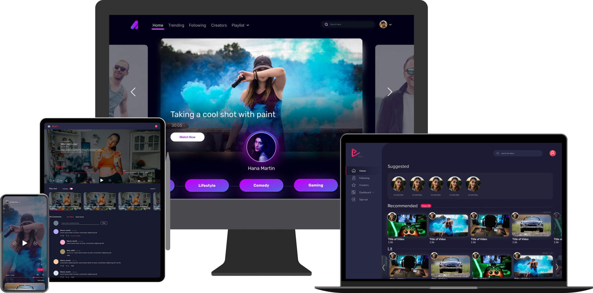
Avybe is a reinvented media platform where social media creators can create authentic content their viewers desire.
Avybe is a streaming platform for the next generation of influencers. Subscribers can watch exclusive, and original content from their favorite creators - not available anywhere else. An advertisement-free platform allowing users to enjoy their favorite content without any distractions!
OVERVIEW
Worked as a Content Writer | Marketing Consultant with stakeholders, developers, marketing, UI designers, and animators to build an intuitive and reinvented media platform where social media creators can create authentic content. I was involved in the overall strategy in terms of voice, tone, and customer analysis. I wrote the copy for the landing page and app experience and also helped UI designers formulate a content strategy for the website and app.
MY APPROACH
Describe how Avybe works in a clear and effective way. The platform has a target audience of users with an age range of 18-25. The majority follow Youtube creators.
3 key points I wanted to promote for the product
Premium Content
Definition: “Get the best content to all of your favorite entertainers.”
2. Exclusive Content
Definition: “Get access to exclusive content you wouldn’t get on other platforms.”
3. Authentic Content
Definition: “Get access to authentic and original videos from your favorite creators.”
Marketing Strategy: Avybe wants to separate itself from Youtube. Slogan: “We are a movement“-- a hub for the modern social media entertainer.
HOW I HELPED
Collaborated with designers and product managers to articulate goals and align on key messages.
Helped establish Information Architecture of app
Helped create an analytics dashboard that showcases data visualization to help creators manage and see their progress
Worked with UI designer to develop a comprehensive style guide
Conducted a competitive analysis
Conducted usability tests with existing users and retained feedback
Developed and wrote copy for email marketing and for product’s digital screens.
Edited existing copy for clarity and tone of voice.
INFORMATION ARCHITECTURE

USABILITY TESTS
I conducted a round of usability tests with users. I sent them a Figma link to our desktop and mobile prototype.
Usability test script:
Hi _____!
Thank you for taking the time to participate in this study for our project. We are currently testing a desktop and mobile version of our app. Your feedback is valuable and will help us determine if our website functions as intended. Also, please don’t worry that you’re going to hurt our feelings. We’re doing this to improve the site, so we need to hear your honest reactions. Go ahead and click on any of the hot spots across the screens. There is a comment icon on the top left of the screen. If you click on that, an orange cursor will appear — where you can write comments anywhere on the screen. An example would be, “Button is too bright”. If you haven't used Figma before, here is a quick tutorial for you. You can click the comment icon on the top left, then use the orange cursor to insert them anywhere on the screens. In essence, we want to hear your overall thoughts about the app. What did you find confusing? Did you think the icons were clear? Did you have any issues navigating from one screen to another? Any type of feedback would be valuable to us!
Questions, please don’t hesitate to ask!
Mobile prototype:
Desktop prototype:
Click Here
User Test Questions:
How old are you?
What is your profession?
Have you ever used an app/website like this? Like Youtube, Netflix, or Quibi? Or any similar apps?
Did you understand the main point of our site?
Overall, was it easy to navigate across the screens?
Was the text readable on the screens?
Were the key icons/elements like “play button”, “follow button” all clear to you?
Did you have trouble exiting out of a certain screen?
What is your general impression of the color scheme?
What would you change about this app?
How would you compare this app to similar apps you’ve used?
RESULTS
Generally, users liked the dark tone and color scheme
Users were able to navigate through the app smoothly
In the mobile version, the captions on the navigation buttons when they are selected seemed unnecessary. A couple of participants suggested to take that out so the buttons aren't constantly shifting. Or just put the caption under the icon.
Some users thought the text was a bit small
Pretty much all participants were familiar with using similar apps like YouTube, Netflix, Vimeo, Hulu, Amazon Prime, Various TV Network Streaming Apps
FINAL THOUGHTS
I was generally satisfied with the user tests. Participants provided deep insight and logical suggestions. The text sizing and other minor issues were easily solved.
STYLE GUIDE (UI/VISUAL & EDITORIAL/COPY)
I helped create a style guide that adheres to Avybe’s voice and tone. We wanted to portray something vibrant, futuristic, and modern. Here’s what we came up with.

Landing page
Work performed: Content Strategy + Content Writing

UX Writing Samples


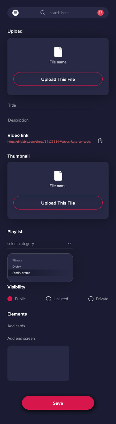
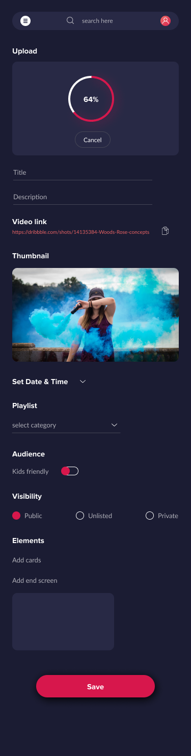
Data Visualization (Visual/UI Design) for our creators
We wanted to adhere to our vibrant and exciting brand voice and tone without sacrificing usability. As you can see, the content and UI elements are clear. The key CTA’s are visible - making navigation simple. On the dashboard analytics page, using dynamic graphs and charts to track a creator’s user analytics allows them to see data holistically and in parts.